


Designer John Gidding On How To Use a Color Wheel To Pick Room C…

Q&A with Organizational Pro Peter Walsh + Dermatologist Shares A…

Actor Hank Azaria + Freezer Meals + Artichokes 2 Ways with Rach

See Inside Barbara Corcoran's Stunning NY Apartment + It's Steak…

How to Make Chicken and Lobster Piccata | Richard Blais

Donnie Wahlberg Spills Details About NKOTB's First Ever Conventi…

Donnie Wahlberg + Jenny McCarthy Say Rach Is Such a "Joy" + Look…

The Best Moments From 17 Seasons of the Show Will Make You Laugh…

How to Make Crabby Carbonara | Rachael Ray
Rach Chats "Firsts" In Flashback From Our First Episode Ever In …

How to Make Apple-Cider Braised Pork Chop Sandwiches with Onion …

Rach's Chef Pals Say Goodbye to Show in Surprise Video Message

How to Make Sesame Cookies | Buddy Valastro

How to Make Tortilla with Potatoes, Piquillo Peppers and Mancheg…

How to Make Shrimp Burgers | Jacques Pepin

How to Make Spanakopipasta | Rachael Ray

Andrew McCarthy Chokes Up Discussing Emotional Trip to Spain wit…

Celebrity Guests Send Farewell Messages After 17 Seasons of the …

Celebrity Guests Send Farewell Messages After 17 Seasons of the …

Andrew McCarthy Teases Upcoming "Brat Pack" Reunion Special

Michelle Obama Toasts Rach's 17 Years on the Air With a Heartfel…
Making a new house feel like home is no easy feat! Luckily, our buddy John Gidding is here to help. And when one married couple shared their decorating dilemma, John knew just what to say.
Kaylyn and Alton recently moved into their dream home, and they need some advice on how to bring their different design styles together.
Kaylyn loves color, especially blues, purples and yellows. Alton, on the other hand, would prefer to stick with neutrals like white and beige. He's afraid that with color, the décor won't match. Right now, their living room features all neutrals, and Kaylyn wants to add a playful pop of color.
RELATED: Decor Debates with John Gidding
So, how do you determine what colors will go together in a room?
According to John, there are two aspects to consider when it comes to color and design. First, the colors you like, and second, the room's intent. Basically, how do you want to feel when you enter this space?
IF YOU WANT TO FEEL ENERGETIC:
Using a color wheel, John demonstrates how contrasting colors — like blue and yellow, for example — can bring a lot of energy to a room. This can be good, as long as it's kept to a minimum, he explains.
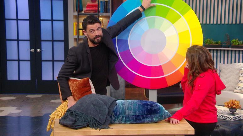
Rachael Ray Show
As an example, John shows the couple two pillows, one in varying shades of blue and one in a burnt orange hue, as well as a mustard yellow blanket. John says these pieces work well together because of their contrast, without going overboard.
"Any time you pick colors from opposite sides of this wheel, you want to use this minimally, sparingly — so that energy is contained to a certain part of the room, for example," John says.
IF YOU WANT TO FEEL RELAXED:
"That said, sometimes you want a room to be relaxing. You want that room to work for you in a way that calms you down," John continues. "In which case you take away the contrasting colors and you bring in harmonious colors."
Rather than selecting colors from opposite sides of the wheel, you can choose adjacent shades that will be more complementary and make you feel calmer. Blues go very well with purples, purples with magentas, greens with yellows and so on, according to John.
See John demonstrate how to choose contrasting and complementary shades using a color wheel in the video above.
RELATED: Clinton Kelly’s Definitive Guide to Mixing Prints and Patterns at Home